
Framing can completely change how a photograph is perceived. The right frame and mat can make an image look cleaner, more intentional, and more valuable, while the wrong choice can make even a strong print feel unfinished.
If you are wondering how to frame photography prints, the main decisions usually come down to three things: frame style, frame color, and mat choice. In this guide, we’ll walk through how to choose each one and how to create a display that feels polished, balanced, and gallery-ready.
Why framing matters for photography
A frame does more than protect a print. It also shapes how the photo is seen.
Good framing can:
- make a photograph look more refined and professional
- guide the viewer’s eye toward the image
- help the print fit better with a room or interior style
- improve how the work feels in a portfolio, online shop, or exhibition display
For photography in particular, presentation matters because small changes in border space, color, and proportion can strongly affect the mood of the image.
1. Start with the right frame style
The best frame for photography is usually simple enough to support the image without competing with it.
In most cases, clean frame profiles work better than highly decorative ones. This is especially true for contemporary photography, documentary work, minimalist prints, and black-and-white images. Neutral, timeless choices such as black, white, and natural wood are often recommended because they stay versatile across different interiors and do not overpower the print.
A good rule is this: the stronger or busier the photograph, the more restrained the frame should be.
Best frame styles by photography type
Black-and-white photography
Black, white, silver, and other restrained neutral frames are common choices for black-and-white prints because they emphasize tonal contrast without distracting from the image.
Color photography
Natural wood, black, white, or subtle metallic tones usually work well. Warm-toned photos often pair nicely with oak, maple, or gold-leaning frames, while cooler images can work with black, white, ash, or silver tones.
Minimal or fine art photography
Thin or medium-profile frames with generous mat space often create the cleanest gallery feel.
Documentary or street photography
Simple black, white, or wood frames usually feel more timeless than decorative options.
2. How to choose the best frame color
Choosing a frame color is less about matching your sofa and more about supporting the image. One framing recommendation is to first look at the dominant colors in the photograph, then choose a frame that complements rather than clashes with those tones. WhiteWall, for example, advises identifying the photo’s dominant colors first and then choosing a complementary frame hue.
A practical shortcut:
- choose black for contrast, clarity, and a modern gallery look
- choose white for brightness, softness, and minimal interiors
- choose natural wood for warmth and a timeless feel
- choose silver or restrained metal for some black-and-white or contemporary work
If you are unsure, black, white, and natural wood are usually the safest starting points.
3. When to use a mat
A mat adds space between the image and the frame. Done well, it gives the photo more breathing room and helps the print feel more deliberate and elevated.
Mats are especially useful for:
- fine art photography
- black-and-white prints
- exhibition-style presentation
- smaller prints that need more visual presence
- signed prints where you want to preserve a visible paper border
Some framing guides note that leaving a small visible paper border can help show the paper texture or leave room for a signature and title.
4. How wide should the mat be?
Mat width changes the entire feel of the piece. Wider mats tend to feel more formal, spacious, and gallery-inspired, while thinner mats feel tighter and more modern. Atlas Wood Company notes this same distinction and also points out that matting changes the final overall frame size.
As a starting point:
- smaller prints usually work better with narrower or medium mats
- larger prints can support wider mats
- minimalist images often benefit from more surrounding space
- busy images often look best with clean, balanced mats
There is no single perfect formula, but proportion matters. Some framing references suggest using a mat that is at least wider than the frame moulding, and common off-the-shelf mat widths often fall around the 2–4 inch range depending on the print and frame size.
5. Should the mat opening be centered?
Not always. A common visual adjustment is to make the bottom border slightly larger than the top and side borders. This helps the print look optically balanced, since a perfectly centered opening can appear slightly low to the eye. Some framing tutorials emphasize the importance of keeping measurements accurate and visually balanced so the image does not feel off-center.
This bottom-weighted look is especially useful for:
- gallery-style framing
- portrait photography
- formal black-and-white prints
- elegant home displays
6. What mat color works best for photography?
For most photography, neutral mat colors are the safest and most versatile choice.
White or off-white mats
These are classic choices because they keep attention on the image and work across many frame styles and interiors. Neutral mats such as white and cream are widely recommended for a timeless look.
Soft gray mats
Gray can work especially well for black-and-white photography because it supports tonal nuance without creating harsh contrast.
Accent-colored mats
These can work when they echo a muted tone already present in the image, but they are usually best kept restrained. A slightly darker or grayer version of a color from the photo often feels more sophisticated than a saturated match.
7. When to use double matting
Double matting adds depth and a more formal presentation.
In most cases:
- the outer mat stays neutral
- the inner mat introduces a subtle accent tone
- the reveal should be small and controlled
This approach works well for fine art prints, classic photography, and pieces that need more separation from the frame.
8. Framing by photography type
Black-and-white photography
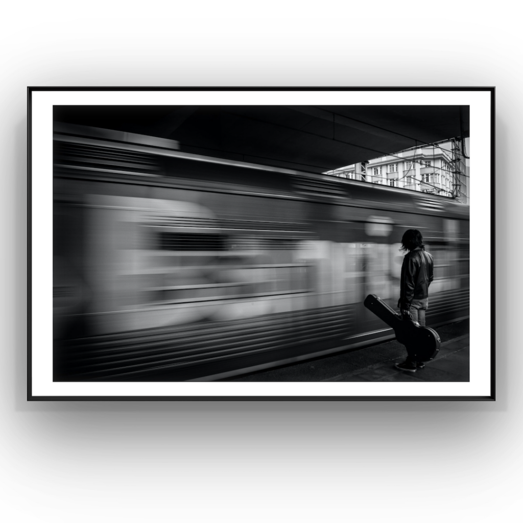
Start with black, white, silver, or natural wood frames, then pair with white, off-white, or soft gray mats. This is one of the most widely used combinations for photographic display.
Landscape photography
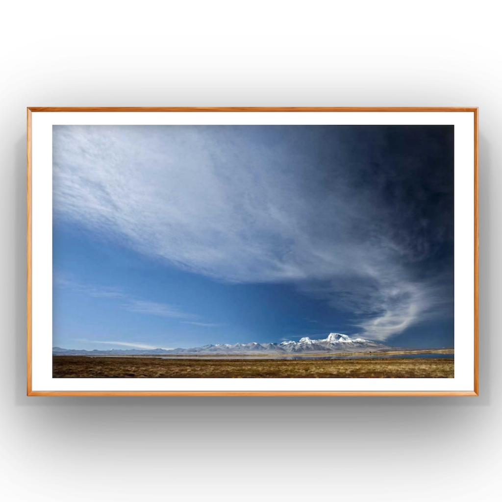
Natural wood and restrained black frames often work well. Wider mats can help create a calmer, more expansive feel.
Portrait photography
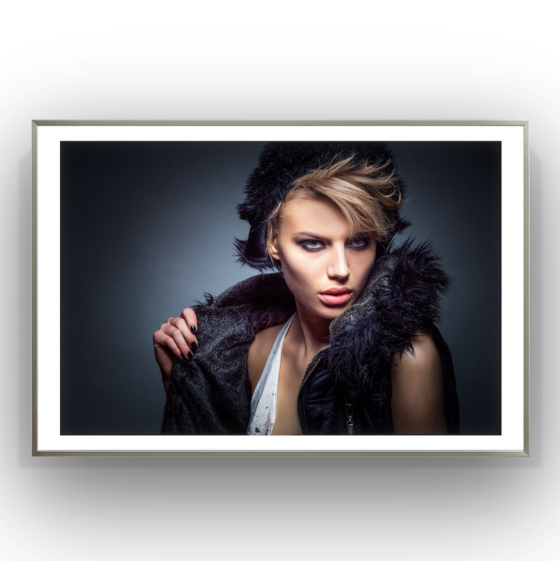
Simple black, white, or warm wood frames usually feel elegant. A slightly bottom-weighted mat can add polish.
Street or documentary photography
Keep the framing simple and timeless. Avoid ornate details that compete with the image.
Contemporary color photography
You can be a bit bolder, but the frame should still support the dominant mood of the image rather than overpower it.
How Wallartee helps
Choosing a frame and mat from imagination alone is difficult. Wallartee helps by letting you preview different frame styles, mat widths, and color combinations before you commit.
With Wallartee, you can:
- compare black, white, wood, and other frame looks
- test narrow, medium, and wide mats
- preview different mat colors
- see which combination gives your photo the cleanest final presentation
That makes it easier to choose a display style that feels intentional instead of guesswork.
Final thoughts
If you want your photography to look more professional, framing is not an afterthought. It is part of the presentation.
The best approach is usually simple: start with a restrained frame, choose a mat only when it improves balance and breathing room, and keep colors supportive rather than distracting. Done well, the result is a photograph that feels more finished, more collectible, and more at home in both a gallery setting and a personal interior.
FAQ
What is the best frame for photography?
Usually a simple frame. Black, white, and natural wood are the safest and most versatile choices for most photography.
Should photography prints have a mat?
Not always, but mats often help photographs look more refined and gallery-ready, especially for fine art, black-and-white, and exhibition-style presentation.
What color mat is best for black-and-white photography?
White, off-white, and soft gray are all common and safe options.
How wide should a mat be for a photo?
It depends on the print size and the look you want. Wider mats feel more formal and spacious; thinner mats feel tighter and more modern. Common ready-made ranges are often around 2–4 inches depending on the print size.
How do I choose a frame color for a photo?
Start by identifying the dominant tones in the photograph, then choose a frame that complements them rather than competes with them.
Leave a Reply