

Choosing the right mat can make a big difference in how your photo looks when displayed. A good mat can add breathing room, improve visual balance, and help the image feel more polished and intentional.
If you are wondering how to choose the perfect mat for your photos, the key factors are mat width, mat color, and the positioning of the opening. In this guide, we’ll walk through each one and show how Wallartee can help you preview your options before making a final decision.
Why matting matters for photo display
A mat does more than fill space between the photo and the frame. It changes how the image is perceived.
The right mat can:
- make a photo feel more refined and gallery-like
- guide the viewer’s eye toward the image
- improve balance between the photo and the frame
- help the artwork fit better with your room or interior style
For both home display and online presentation, matting is one of the easiest ways to make a photo look more finished.
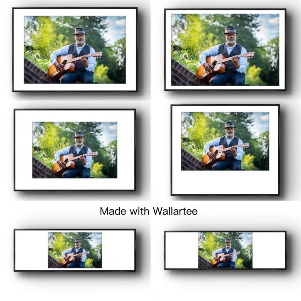
1. Choosing the right mat width
Mat width affects how much visual space surrounds the photo.
In general, wider mats create a more spacious and elevated feeling, while narrower mats feel more compact and understated. A mat that is too narrow can make the image feel crowded, while a mat that is too wide may overpower a smaller photo.
As a starting point:
- smaller photos usually work better with narrower mats
- larger photos can support wider mats
- simple compositions often benefit from more breathing room
- bold or busy images may look better with a cleaner, balanced border
The goal is to create a sense of proportion between the image, the mat, and the frame.
2. Understanding mat positioning
The position of the mat opening can subtly change how the photo feels.
A common choice is to make the bottom border slightly larger than the top and side borders. This creates a more balanced visual effect because a perfectly centered opening can sometimes appear slightly low to the eye.
This approach is especially useful for:
- formal photo displays
- portrait photography
- gallery-style framing
- images meant to feel elegant or classic
Even a small adjustment in the bottom margin can make the final presentation look more intentional.
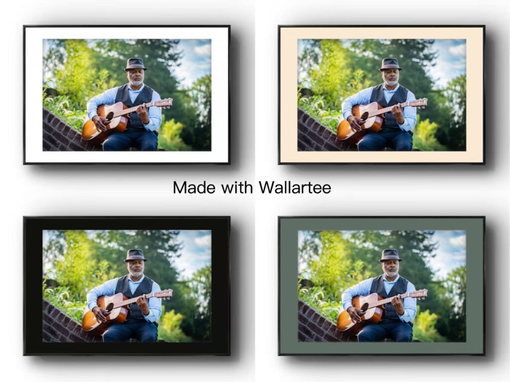
3. How to choose the right mat color
Mat color has a major influence on the mood of the final presentation.
Neutral mats
White, off-white, cream, and soft gray mats are the most versatile choices. They work well when you want the photo to remain the main focus and prefer a clean, timeless look.
Darker mats
Darker mats can create drama and contrast, especially for high-contrast photos or more contemporary interiors. They are often useful when you want the image to feel bold and graphic.
Accent-colored mats
A mat can also pick up a subtle color from the photo itself. This works best when the tone is restrained rather than overly saturated. A muted version of a color already present in the image often creates a more cohesive result.
4. When to use double matting
Double matting adds an extra layer of depth and detail.
In most cases, the outer mat stays neutral, while the inner mat introduces a subtle accent color. This can help connect the mat to the tones inside the photo without making the overall presentation feel too busy.
Double mats often work well for:
- classic photography presentation
- fine art prints
- exhibition-style displays
- images that need a little more depth or separation from the frame
5. Match the mat to the style of the photo
Different photo types often benefit from different mat choices.
Black-and-white photos
White, off-white, or soft gray mats usually work well because they keep the presentation clean and timeless.
Color photography
Neutral mats are usually the safest choice, but subtle color echoes can work beautifully when the image has a strong dominant tone.
Minimal photos
Minimal images often benefit from wider mats because the added space reinforces the sense of calm and focus.
Detailed or busy images
Photos with lots of visual detail often look better with balanced, understated mats that do not compete for attention.
How Wallartee helps you preview mat choices
Choosing a mat can be difficult when you are making decisions from imagination alone. Wallartee helps by letting you preview different combinations before you commit.
With Wallartee, you can:
Try different mat widths
Compare narrow, medium, and wide mat layouts to see which one gives your photo the best balance.
Test different colors
Preview neutral mats, darker mats, or subtle accent colors to find the most suitable match for your image.
Adjust the presentation visually
See how matting changes the overall look of your framed photo and choose the version that feels most polished.
Make decisions with more confidence
Instead of guessing, you can compare options directly and choose the one that fits your photo and your space best.
Final thoughts
A well-chosen mat can make an ordinary photo feel far more intentional and display-ready. By paying attention to width, color, and positioning, you can create a presentation that feels balanced, elegant, and suited to both the image and the surrounding space.
If you want to experiment with different photo mat styles before framing, Wallartee makes that process easier by helping you preview your options visually.
FAQ
What is the best mat width for photos?
The best mat width depends on the size and style of the photo. Smaller photos usually look better with narrower mats, while larger photos can support wider mats.
Should the bottom mat border be larger?
Yes, in many cases a slightly larger bottom border creates a more balanced visual effect.
What color mat works best for photos?
Neutral colors such as white, cream, off-white, and soft gray are the most versatile. Accent colors can also work when they pick up tones already present in the photo.
Is double matting good for photography?
Yes. Double matting can add depth and make a photo feel more refined, especially for classic or exhibition-style presentation.
How can I preview a mat before framing?
You can use Wallartee to test different mat widths, colors, and presentation styles before making a final choice.
Leave a Reply